Once your product has a compelling name, the next logical step is to extend the name into a compelling logo. Our product is a story, “How to Make a BoogerBall“, and its primary delivery vehicle is the website, BoogerBall.com. The focus for our discussion about logo design, therefore, will be a logo for BoogerBall.com.
 In learning how to design logos for several customers, I continue to research logo design and I have found that there are some basic fundamental requirements for an effective logo. You’ll notice that I did not say “good logo”. This is intentional because the judgment of logo design is an entirely subjective thing. I’ve designed a logo or two that were very effective. I thought they were “good” but my customer did not.
Here are the essentials: an effective logo should be simple (representing the very essence of the product or service), memorable (unique in it’s market segment), re-creatable by others (skilled in the craft), scalable (legible at the size of a postage stamp and at the size of a billboard), use as few colors as is reasonable (the more colors, the more cost), and be recognizable both in color and Black & White. Each of these general requirements has a rich history linked to the processes of printing, publishing, digital presentation and advertising.
A logo may be made of two different elements, namely the Mark and the Word Mark. The Mark is a graphic of some type. It may or may not include text elements. The Word Mark is some amount of text that usually accompanies the Mark. 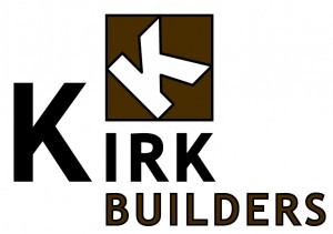 This logo has a Mark represented by the tilted “K” and a Word Mark represented by the text “Kirk Builders”. Some logos are only made of one of these elements. Often the desire is that the Mark becomes recognizable even without the Word Mark. The challenge is to balance all of these fundamental requirements and actually design an effective logo.
So armed with this knowledge, where do I start? Always start with what you know. BoogerBall.com is a website whose purpose is to feature a story about how to make a BoogerBall. The concept was developed from the mind of a guy with no sisters who was barely 20 when he became the father of a four year old girl. He thought it would be fun to tease her about saving his boogers and 14 years alter he was still enjoying the idea of saving his boogers in a big BoogerBall for his daughter. The original story appeals to people on two different levels: first, as an actual step-by-step instruction about how to really make a BoogerBall and second as an absurd fantasy about what would happen if you actually saved your boogers for 14 years. Both levels of appeal speak directly to one demographic – 12 year old boys. Only a 12 year old boy would take pleasure in the thought of saving boogers in a BoogerBall for 14 years to give it to a girl, and only a 12 year old boy would have the interest in actually exploring how to produce a BoogerBall from household materials (alas, at heart, I am still a 12 year old boy).
Now, what does that all mean to the point of our logo design effort? Well, it seems prudent that the logo feature an image of the BoogerBall itself as the Mark and the word BoogerBall(.com) as the Word Mark. It also seems like a good idea that the logo be clean and zippy enough that a 12 year old boy would want to wear it on a shirt.
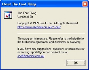 Developing a successful Word Mark starts with selecting a font (or type style). Fonts are so important to an effective Word Mark. The text needs to be appealing but readable, memorable but simple – the complexity of the font should not distract from the overall design of the logo. I have collected so many fonts that it is sometimes difficult to choose just one. I usually start with an idea (clean and zippy and appealing to a 12-year-old boy) and then jump into my favorite tool, The Font Thing.
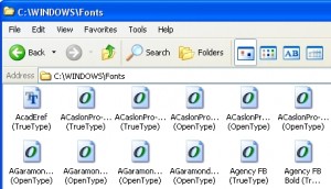
On my computer, I have two folders of fonts. First, like you Windows users, my c:\windows\fonts folder contains all of the fonts I’ve installed over the years.
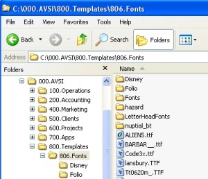 Second, my server has a folder 000.AVSI \800.Templates \806.Fonts that contains a host of additional fonts that I’ve purchase, downloaded for free or received through some software purchase. The Font Thing is a tool that enables viewing samples from both folders with ease. You can download this free tool here (if you’re running Windows 7 you should read this post about making it work on your system). Once installed, you can type in the text you’d like to sample, adjust the sample size and scroll through every font you own.
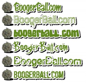
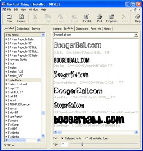 After scrolling through hundreds of fonts I chose these six as being zippy and appealing to a 12 year old boy (me). Using Adobe Illustrator, I started some Word Mark concepts. With the word BoogerBall.com as the basis and the font as the main design element, we start a clean design using layers to accentuate the words. The color green is an obvious choice for the text which is placed on the top layer. Behind that. a layer of white that has a larger line width really makes the green text stand out. Finally a layer of black outline at the back clearly defines the edges of the Word Mark. Putting all these together gives some interesting choices for word marks.
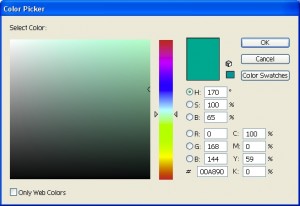
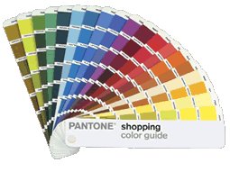 An aside about color choice – this topic is worthy of its own post as there are so many ways to choose color and so many factors to consider. In choosing the color green, I decided to return to my offset printing background and choose a common color of ink. Many print shops offer colors of ink at no additional charge on certain days of the week. This means that on Monday they will load up a press with Pantone® Red and Tuesday with Reflex Blue, etc. If you want red printing you can have it for free if you can wait until Monday to have it printed. Otherwise they will charge extra to clean out a press and put your special ink color in it. I have a Pantone® chart (Pantone® is a brand of ink commonly used by print shops) that is one of my favorite tools to choose color. From the chart I chose Pantone® Green as the basic color of my Word Mark. Illustrator enables accurate color choices of Pantone® colors by using the built-in Swatch Libraries. My basic Pantone® Green is RGB 0-168-144, CMYK 100-0-59-0.
Back to the font choice – LetterheadFonts.com produces some of my favorite fonts. Although I’ve not had the resources to purchase many of their excellent fonts, I do own a few that I love. Speedstyle is a font that is commonly used to write driver’s names on their race cars. It’s just the font that I think would look clean and zippy on a shirt.
 So here’s the Word Mark that I came up with. It’s not perfect but i think it’s effective. The next step (for another post) will be to add a graphic (the Mark) to complement the Word Mark – probably an image of the BoogerBall itself.
